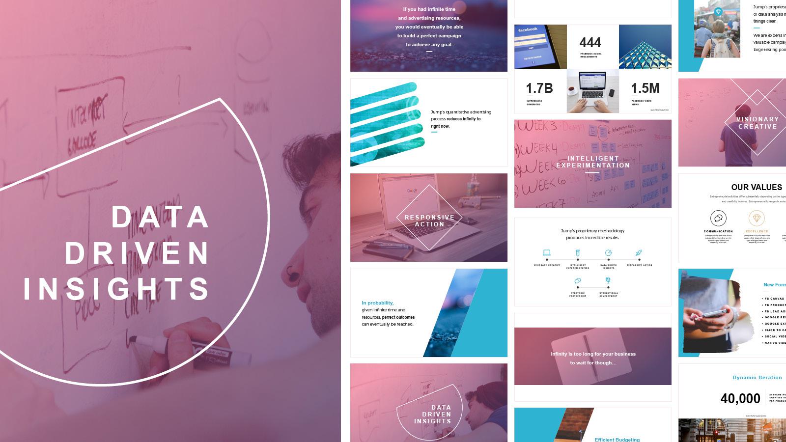
We’ve all been there. You’re at your computer with fresh cup of coffee and a motivational playlist all queued up. PowerPoint is open (and finally updated for the 10th time this week but jeez never mind that...). The cursor is patiently blinking on that first, blank slide, and you’re ready to kick this project in the 🍑.
And then it hits you.
You look at your screen and see that crushing, unconquerable abyss that is a. completely. blank. slide.
Ugh. It can make you want to abandon ship before you even get started.
But don’t let that pesky blank page get the best of you, I’m here to let you in on a little secret: don't freeze up.
The trick to getting over the fear of starting from nothing is to start with something. Just slap something down and go from there. Anything works! Just do it.

Now you’re probably thinking woah woah woah, how am I going to just wave my magic marketing wand and make something appear out of nowhere?
Good news: there’s no magic required. It's a psychological trick–once you have something on your page, your mind kicks over to "editing" mode instead of "creating" mode–and voila! You're awash with new ideas.
How to take that first stab? Try picking one element to use as a jumping off point.
Here are some of my go-to starting points:
Inspiration Search
Sometimes you just need a little inspiration to get those creative juices flowing. Scrolling through polished design is a great way to kickstart your brainstorming process. It can show you what elements you like and dislike about a design, so when it’s time to start your own, you have a solid idea of how to get there.
At Lightboard, we love Dribbble – a site where designers all over the world showcase their work. Because posting to Dribbble is invitation-only, the overall quality of the work is much higher than you'll find elsewhere on the internet. You can find designs you love and add them to “buckets” which you can use to store PowerPoint slides, whitepapers, display ads, and other designs you want to use for inspiration.

And then of course there's Pinterest. It's not just for recipes; you can create boards to store things like typography, color palettes, backgrounds, etc. as inspiration. Or, at the start of a specific project, use a Pinterest board to collect pins and curate a mood for your design.


Stock Photos
You’re probably no stranger to stock photos. Considering content with an image gets 94% more views than content without, it’s safe to say you’ve probably slapped a stock image on something at some point in your career. But have you ever thought of using stock photography as inspiration?
Flip through Pexels, Unsplash, or your own go-to stock photo site and find a photo that makes your soul sing. Drop it into that empty canvas and see what happens. Boom! Now you have a good idea of colors and textures you can incorporate. If you need some ideas, check out this guide on how make stock images content ready. Fills up the page quite nicely, huh?

Vector Graphics
When time is tight, what you need is a head start. For the right project, stock vector graphics are simple, fast, and get the job done. There are tons of places out there where you can find different components to use in your design. The Noun Project and Icons8 both have a curated collection of stock icons that you can edit directly on their platform.

Sites like Depositphotos, Pixabay and Adobe Stock offer more than just pictures, they also have vector art and illustrations you can use as pieces of your design. If you do end up pulling in one or more of these resources, they don’t even need to stick around to the final design. Sometimes they fulfill their vector destiny by just helping you move forward at the beginning of the design process.

Colors
If you’re looking for a way to conjure up a little creativity, try starting with the nuts and bolts. Picking a color palette first is a fun and approachable way to begin. Let’s give a shout out to technology for making this process interactive and simple!
There are tons of color palette generators out there, but I like Coolors because you can lock colors into your palette, adjust shades, and even directly integrate the generator into your Adobe creative products.


Looking for a more dimensional design? Try UI Gradients, a simple and beautiful gradient generator. 😍
Templates
Don’t reinvent the wheel. In marketing, you need to churn out new content frequently and fast. Get a head start by using a template to kick off your design. Hubspot has an awesome round-up of templates for social media, infographics, ebooks and more. Or if you’re looking for a range of options, databox has a list of 3,520 links to marketing templates. Wowza.
I mean come on, how cool are those? Slide templates, display ad templates, landing page templates, infographic templates, OH MY!

Starting a new design - no matter what it is - can be daunting. But the only way you can go wrong is to give up. Don’t stare at an empty screen for hours on end, just slap something down to get yourself in a creative mindset. It doesn’t even need to be something that will make it into the final design, just start with something. You can do this, I promise. 🌟

